Model Features
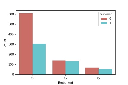
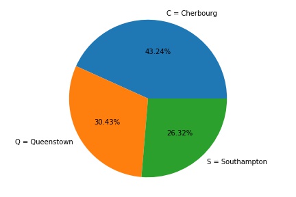
Embarking Location
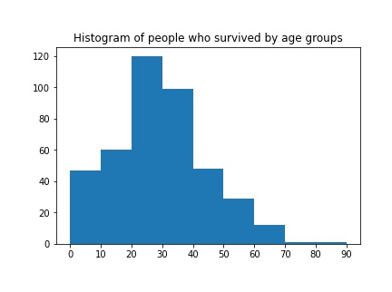
Age
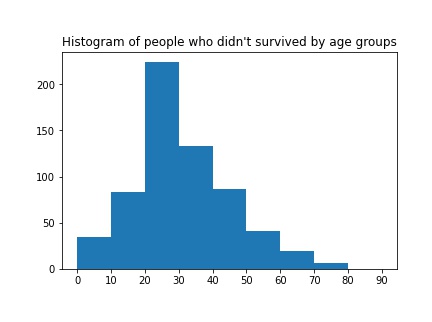
These histograms show survival and perishing counts by age.
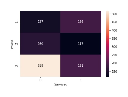
Passenger Class (Pclass)
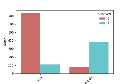
These histograms show survival and perishing counts by age.